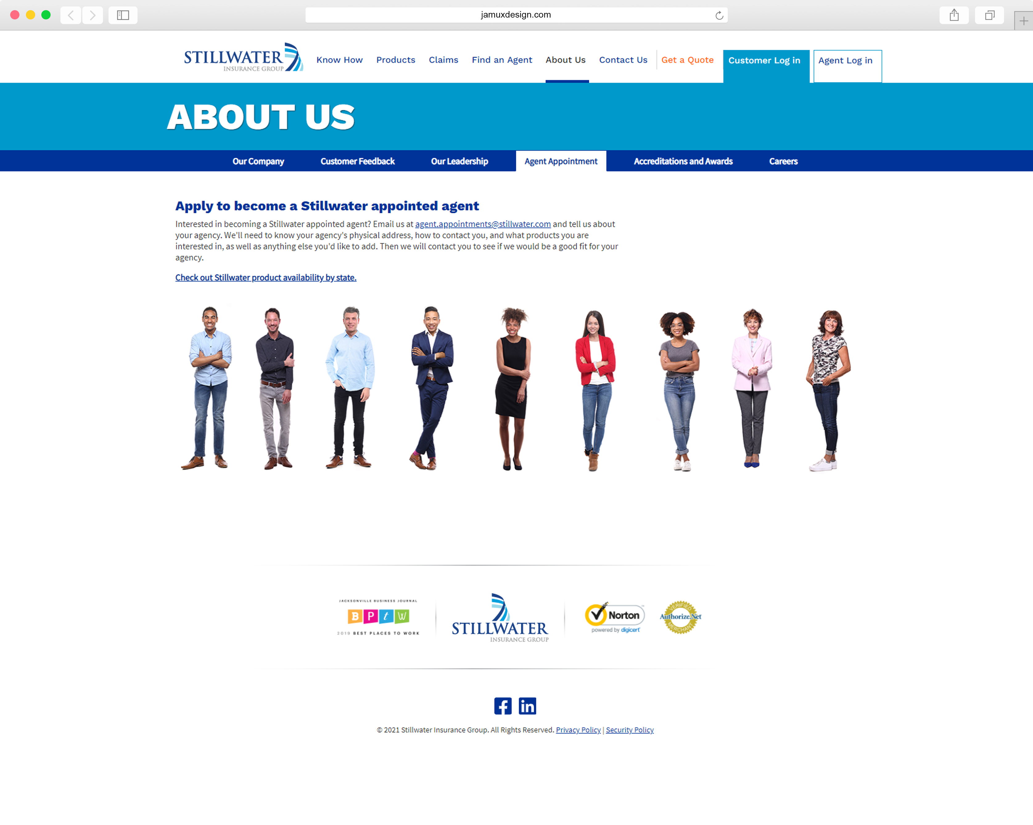
Marketing Site Redesign
Stillwater Insurance launched an ambitious campaign to appeal directly to consumers. Previously, most quoting and policy management was handled by independent agents and specially designated agents with other insurance companies Stillwater had a relationship with. Television, billboard and digital ads were created by an outside advertising agency. Leveraging the “look and feel” and incorporating the “Know How to Insurance” concept was the starting point for this project.
1. The two key objectives for the marketing site…
I. Decode “Insurance Speak”
A key feature of the new direct-to-consumer campaign was the tagline “Know How to Insurance”. The intent of this was to differentiate the Stillwater brand from competitors by highlighting Stillwater’s commitment to providing easy to understand explanations of such phrases of ‘additional interest’ and ‘actual cash value’.
II. Provide multiple ways to get a quote
Let’s face it, insurance is about selling policies. That said, consumer insurance is a super competitive business. Your prices have to be on point and be able to provide outstanding support. Getting a quote is the first step a consumer takes. A primary goal of the marketing site was to provide a constant (but not obnoxious) path to start the quoting process.
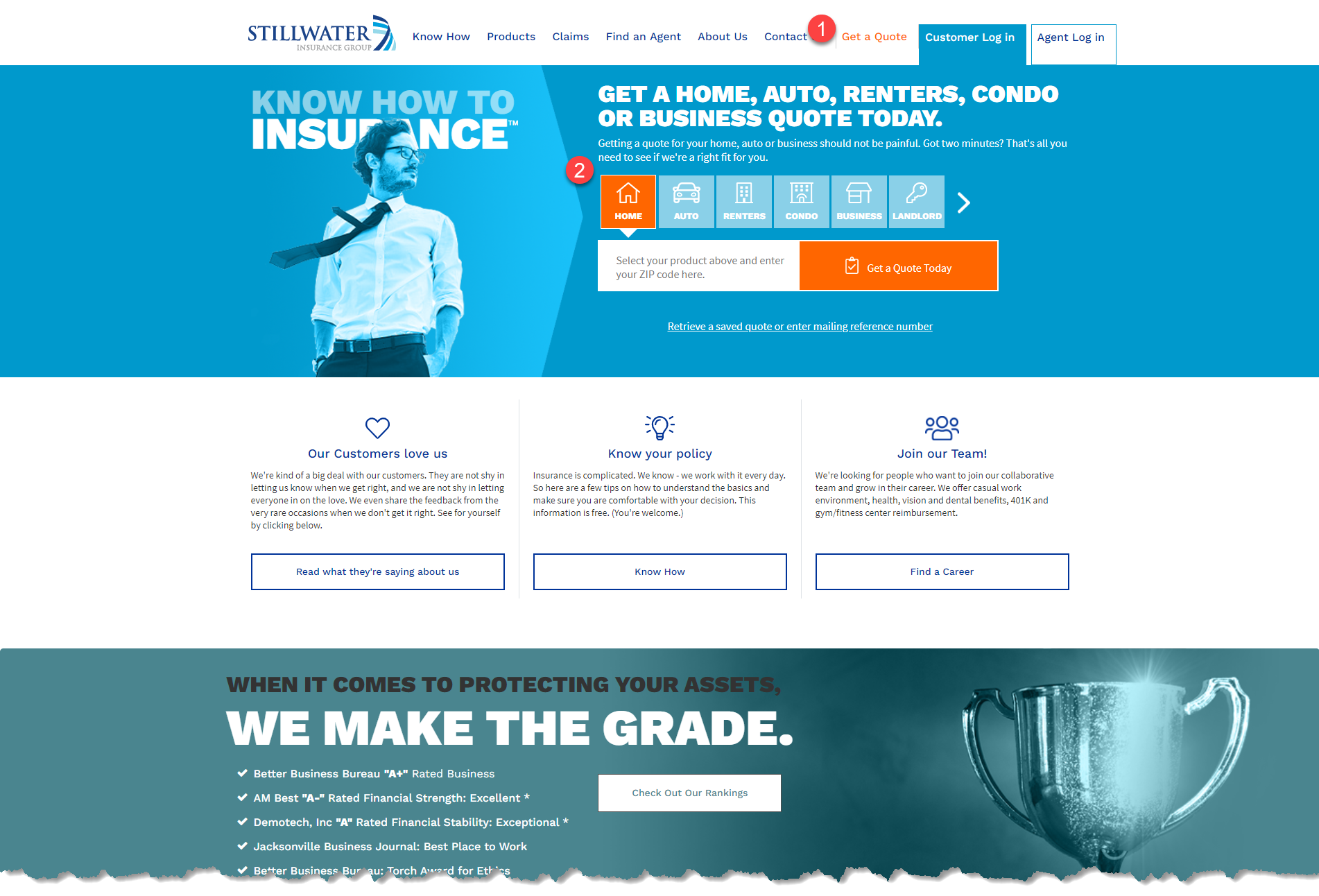
1. Get a Quote is given prime placement on the header element and is present on every page within the site. If a user is exploring Stillwater’s products or in the Knowledge Base, they can always ‘act’ by simply clicking on Get a Quote. The quoting process is guaranteed to deliver a accurate quote in 5 minutes or less.
2. Product selector is integrated into the ‘hero banner’ of the home page. By default the ‘Home’ product is selected, but the user can easily select other products. Once the product is selected, it’s a simple matter of entering a zip code and clicking Get a Quote Today.
2. Know How
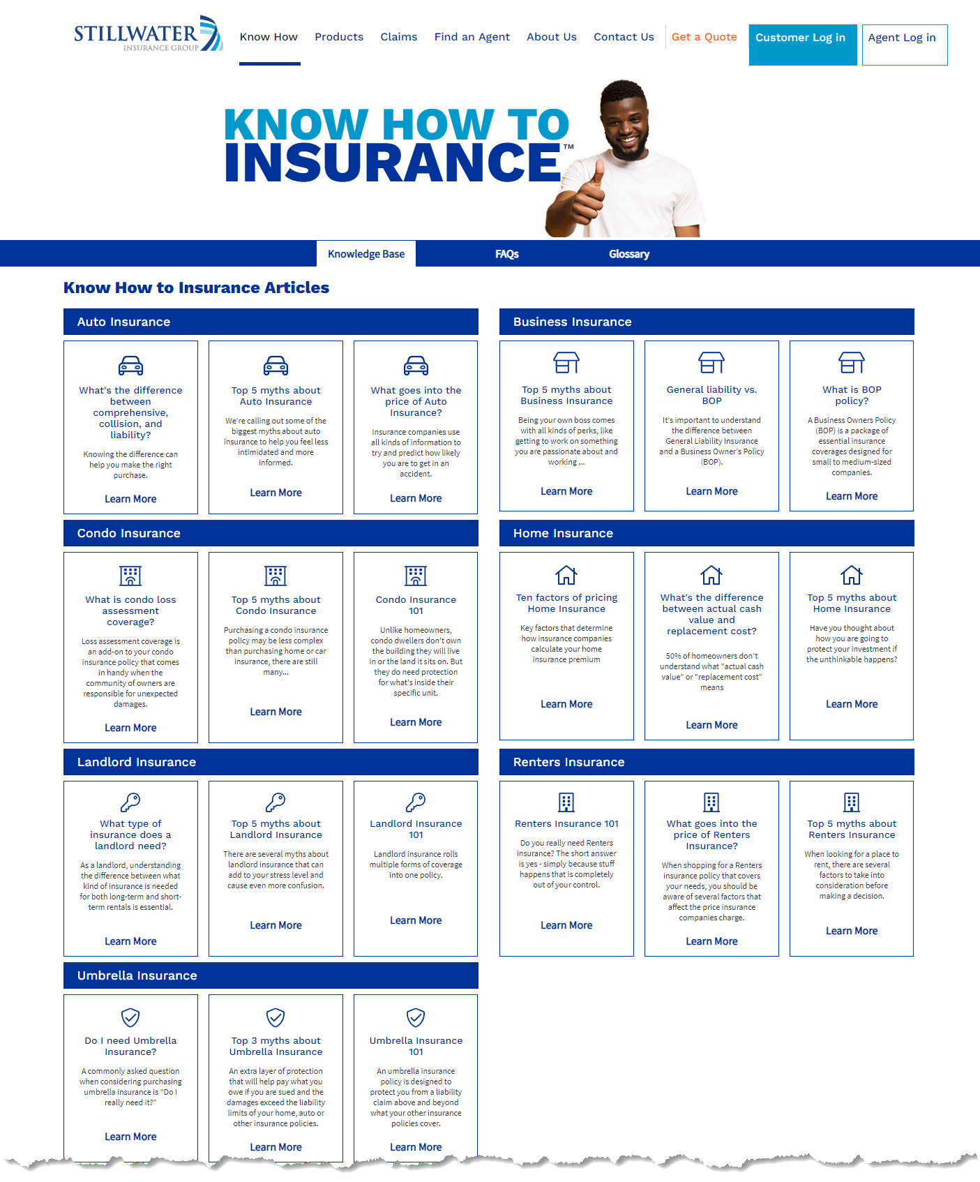
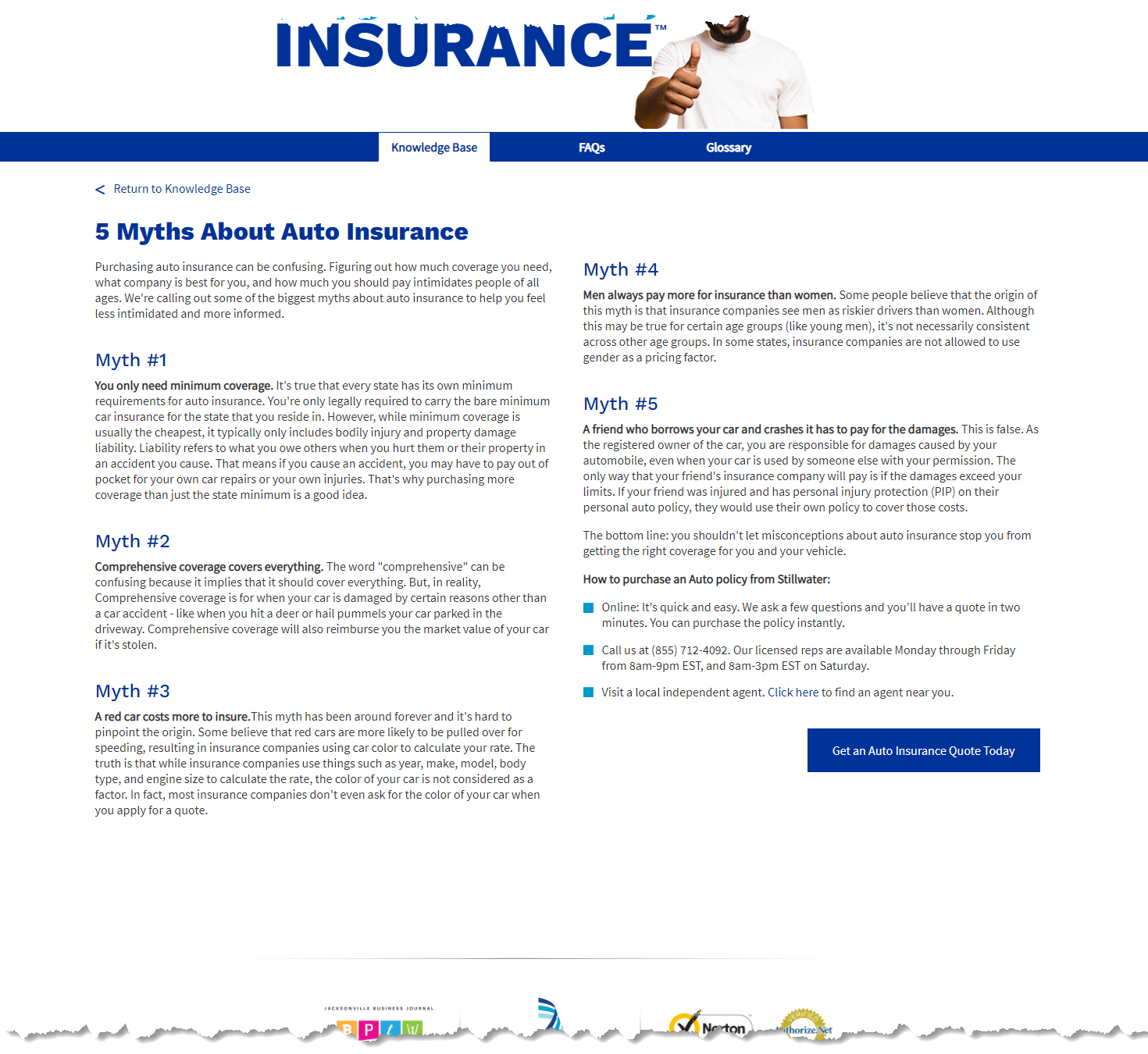
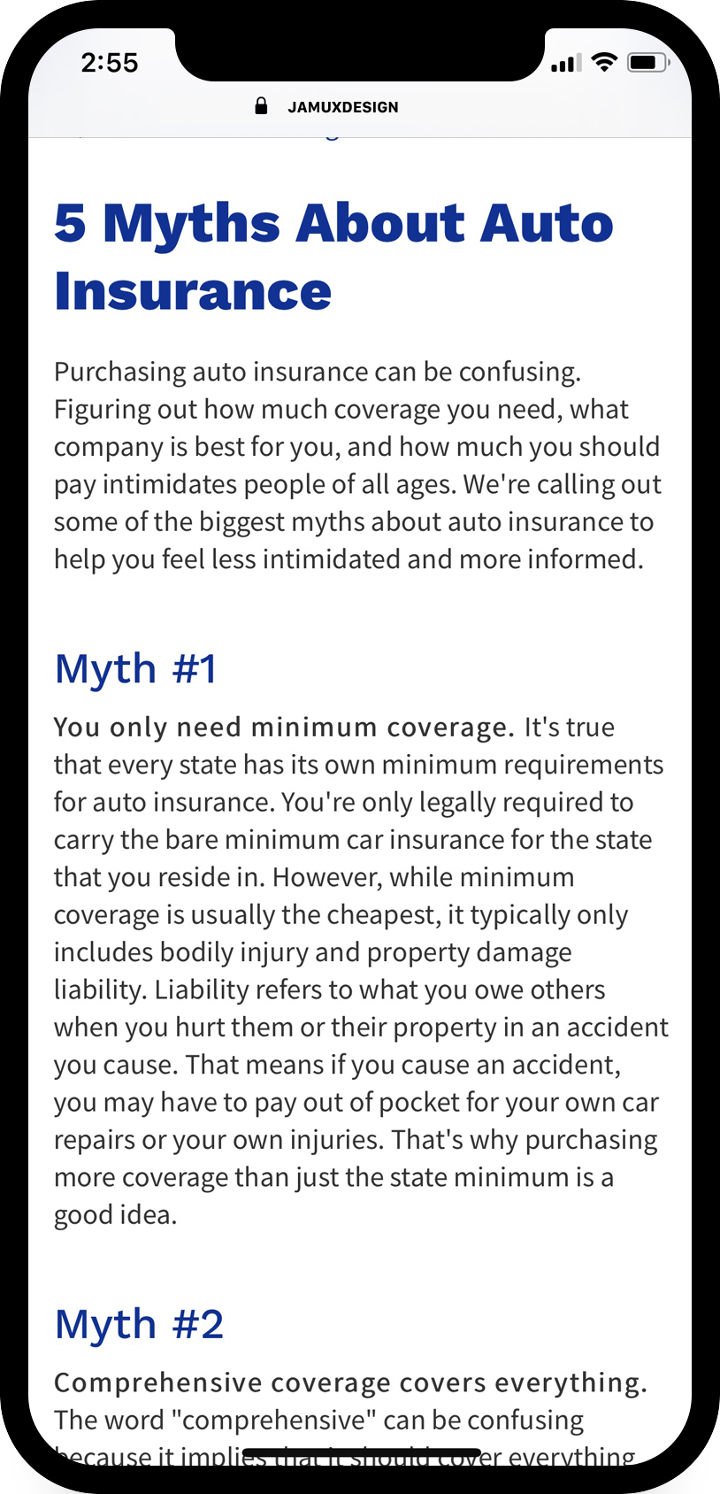
The Knowledge Base is a key component supporting the Know How to Insurance campaign. Digital ads drive consumers to specific articles which drive consumer engagement with Stillwater and entice the user to get a quote.
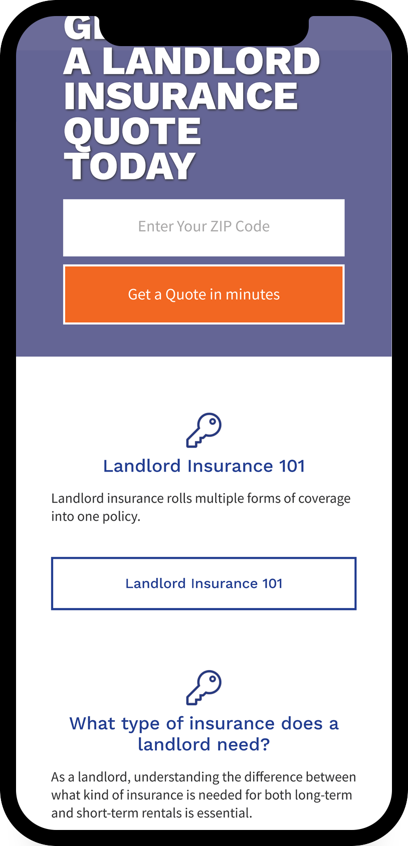
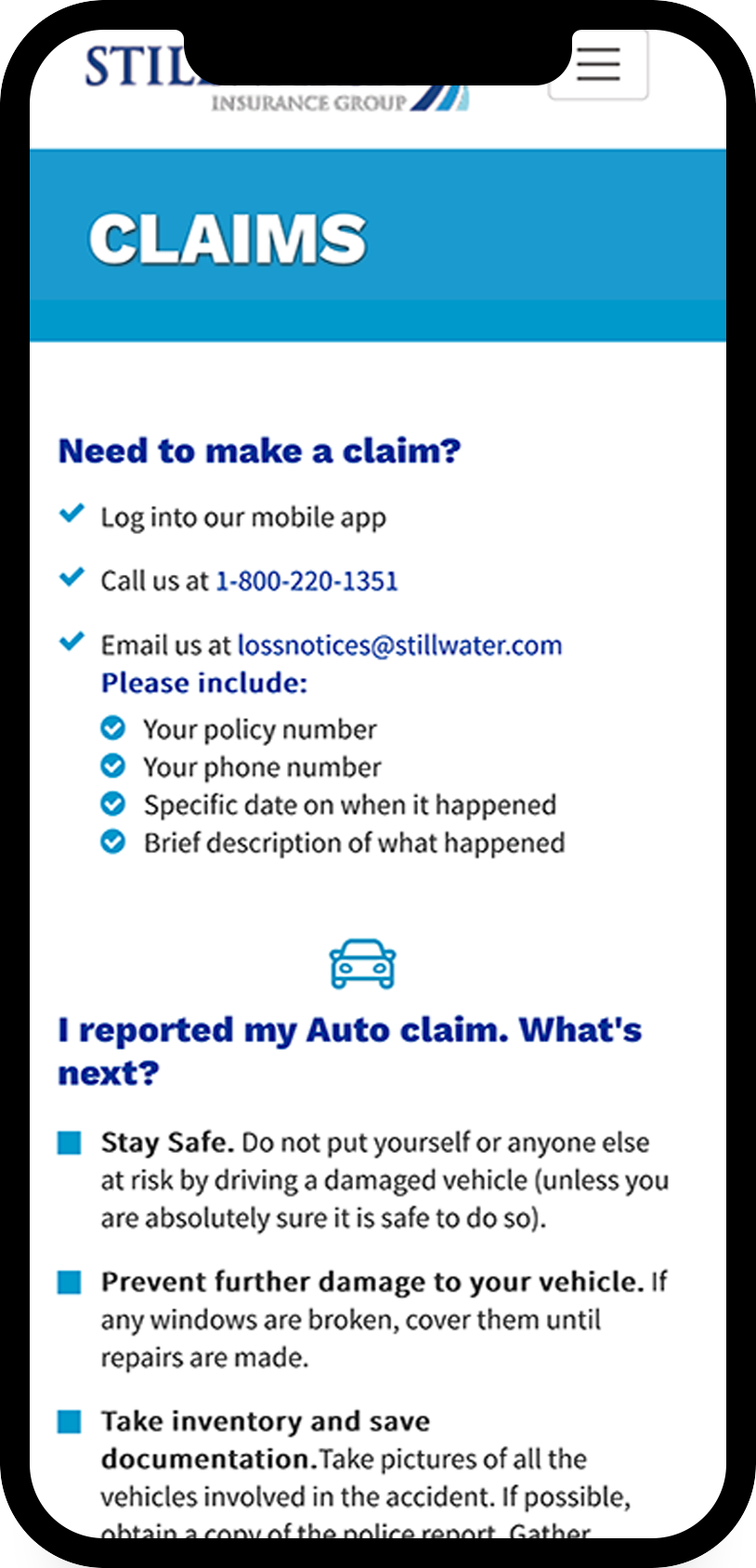
3. Mobile, Desktop, Tablet, No Problem…
4. Make Initiating a Quote Ever Present and Accessible
Having the Get a Quote available, no matter where you are in the site, is a way to insure when the moment is right Stillwater is ready to help.
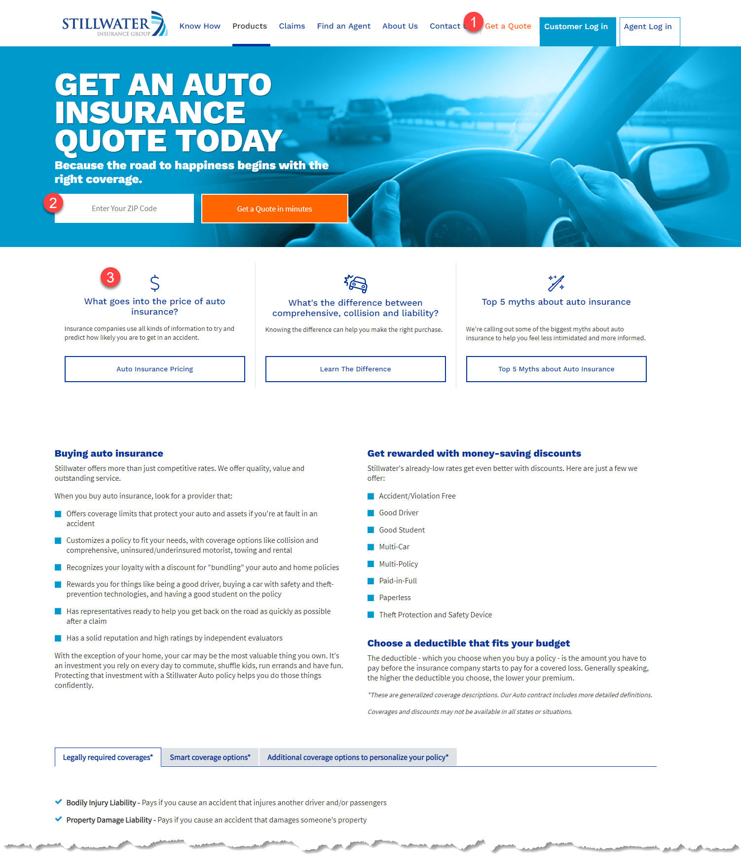
1 – Get a Quote
At anytime, anywhere on the site a potential policy holder can initiate the quoting process. The Get a Quote link is located in the header element on every page within the marketing site. Once the user clicks on the Get a Quote link – they will have to enter zip code and select product (home, auto, renters, etc.).
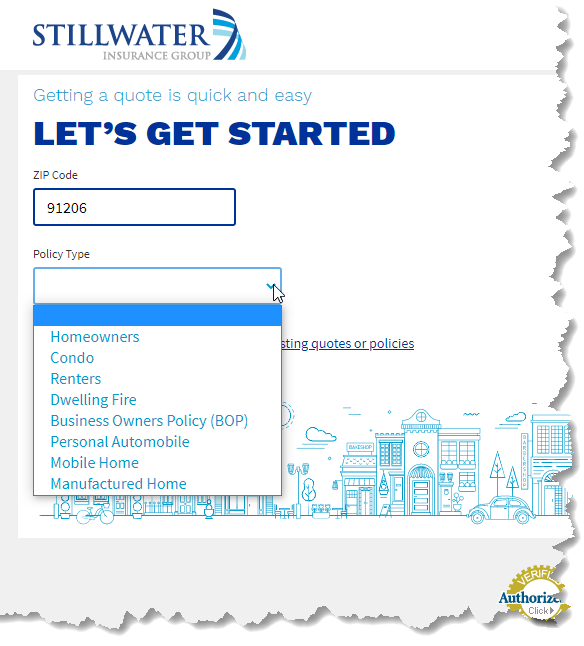
2 – Product Specific Quoting
Bypass the zip code and product selection. Supported by digital ad campaign, a user will be served an ad for Stillwater Auto Insurance and be directed to Auto Insurance page, where they can directly input their zip code and have the specific product pre-selected in the quoting process.
3 – Provide Opportunity to “Know How to Insurance”
Each product page has modular ads that are placed based on engagement from the Knowledge Base. Stillwater knows what the consumer is interested in and provides a convenient way to learn more about the particulars of a product offering.
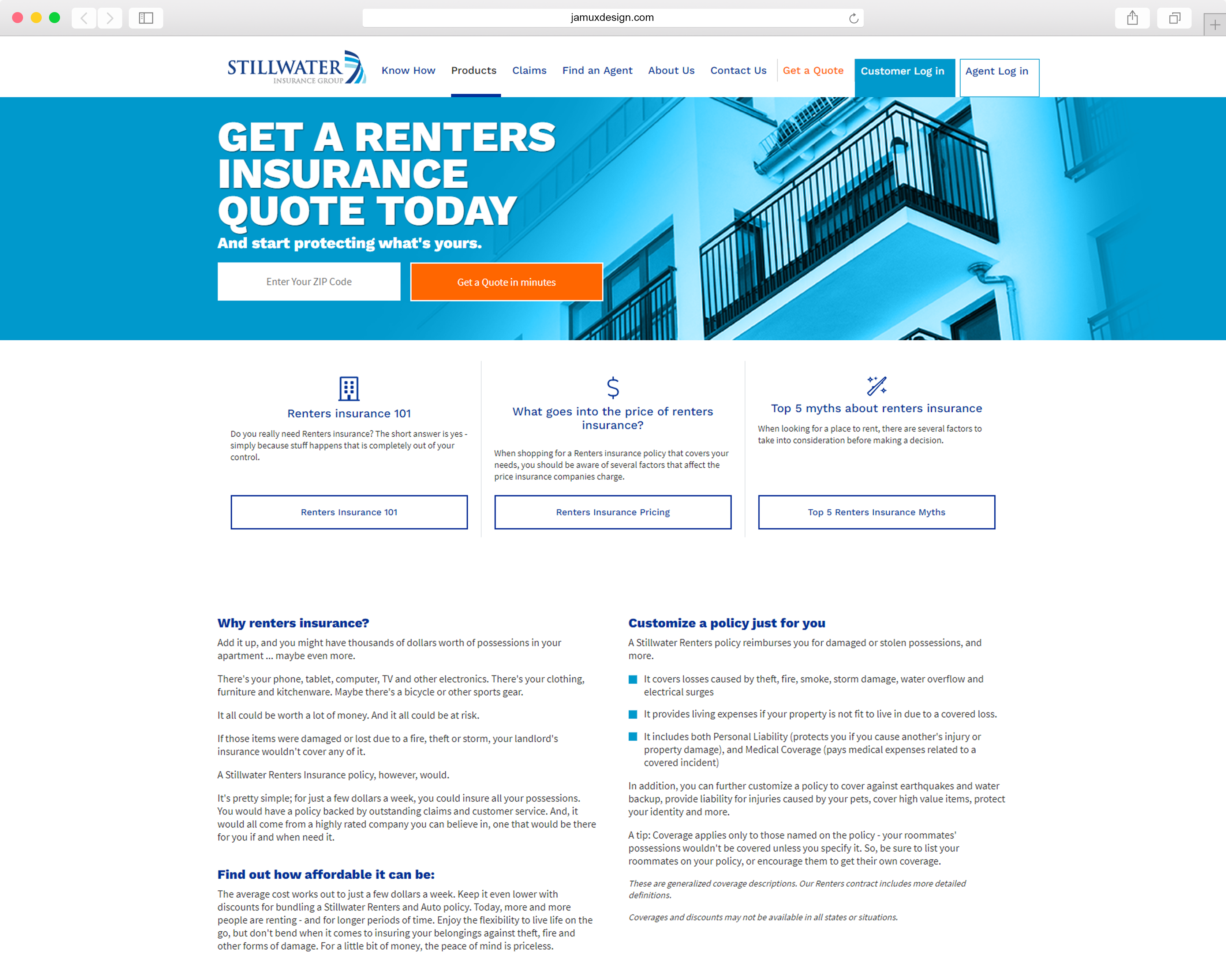
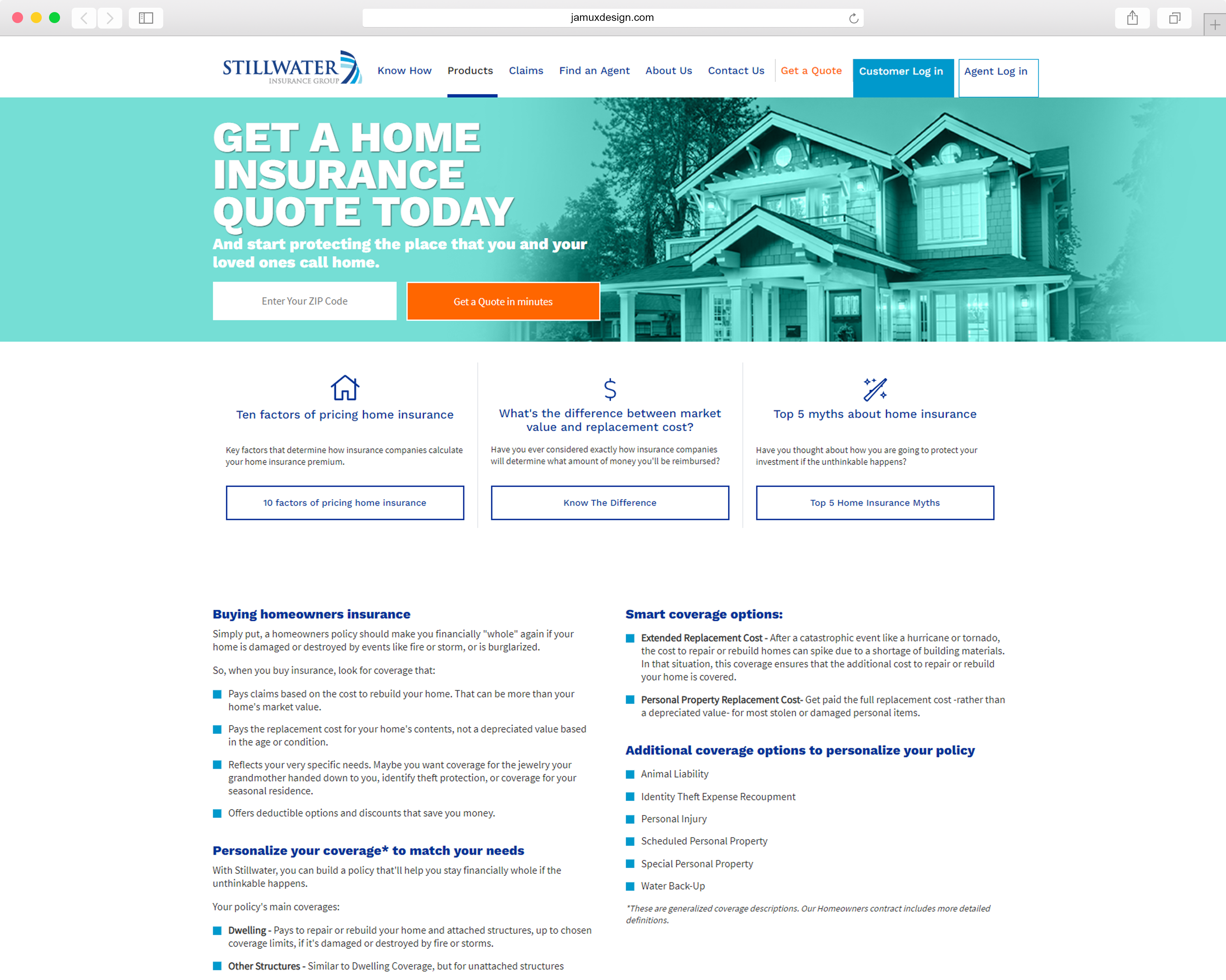
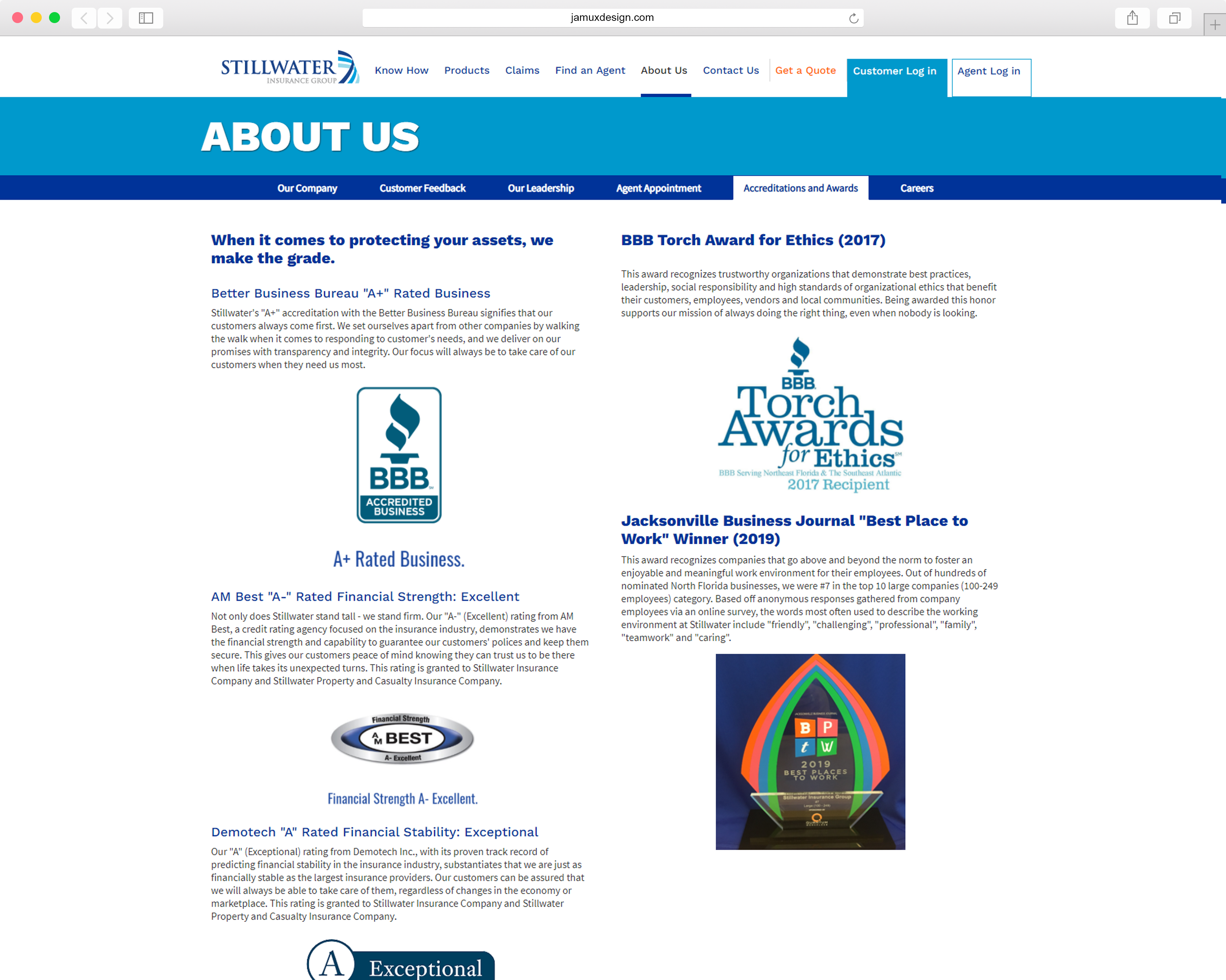
5. Maintain a consistent and intuitive design throughout various standard company details and information.
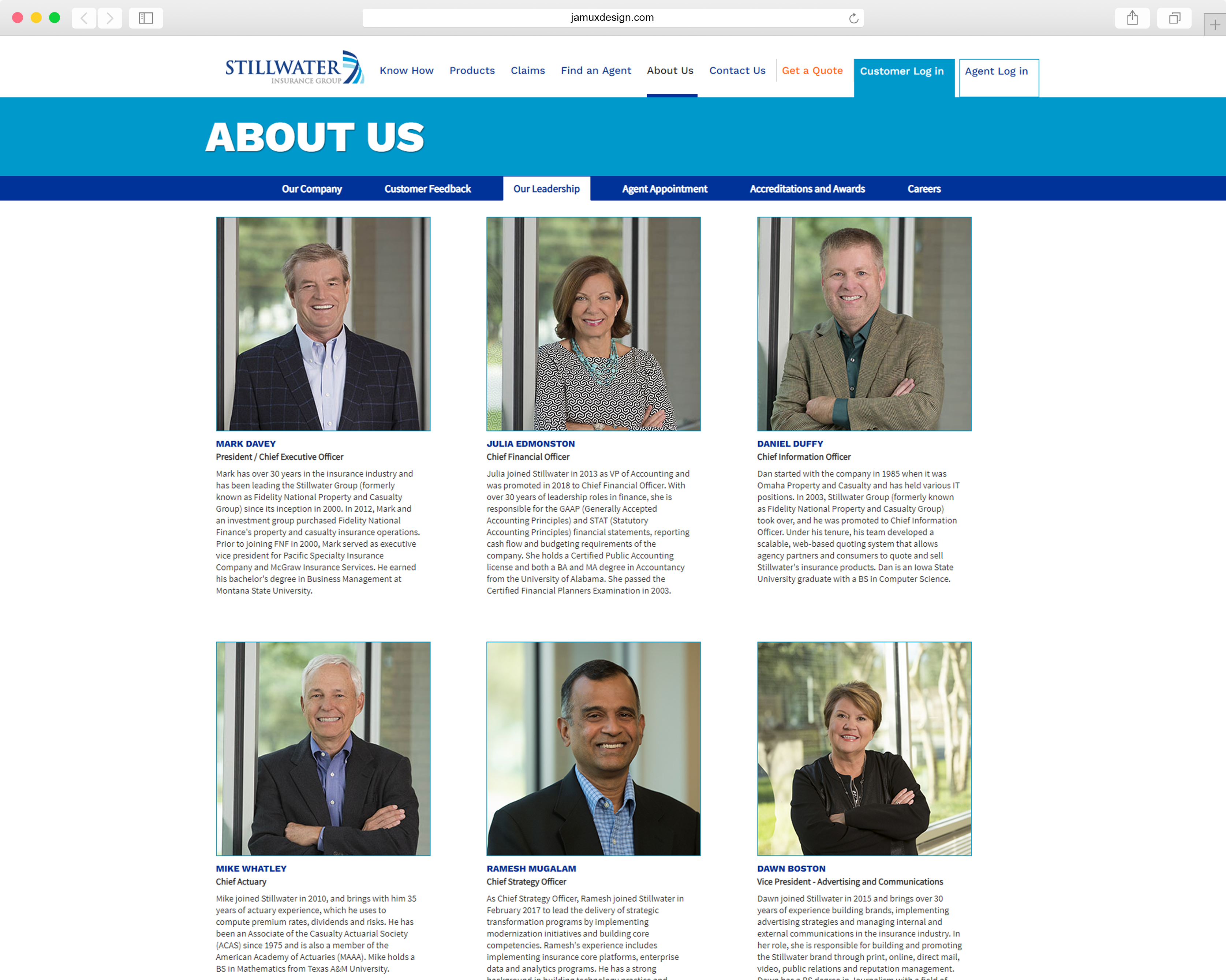
All wireframes & prototypes created with Figma

