
Direct to Consumer
Stillwater Insurance was for years dedicated only to independent agents to sell & manage consumer policies. My UX/UI work was dedicated to designing the consumer experience in both marketing and transactional domains.
Key successes were a steady increase in consumer mobile app adoption and more policies were sold directly to consumers than through independent agents in 2021.
1. We Know How To Insurance.
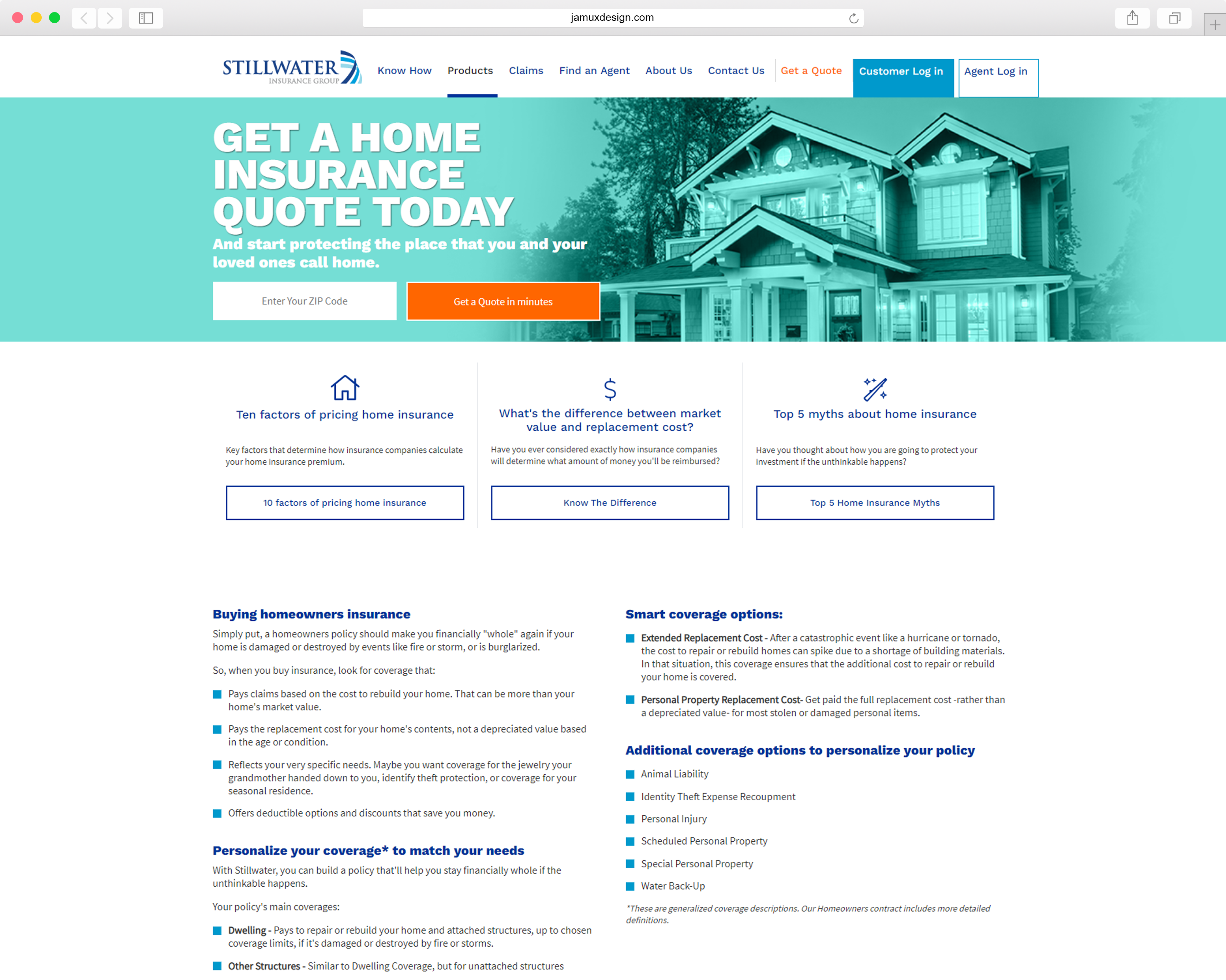
The first order of business was to create a “brand” to help us stand apart from various competitors and have a compelling message to stimulate and promote brand awareness. By partnering with Marketing & Communications department I was able create a visual form for the ‘new’ consumer facing Stillwater Insurance Brand. For more details on the marketing site, view my Marketing Site Case Study.
2. Get a Quote → Buy a Policy
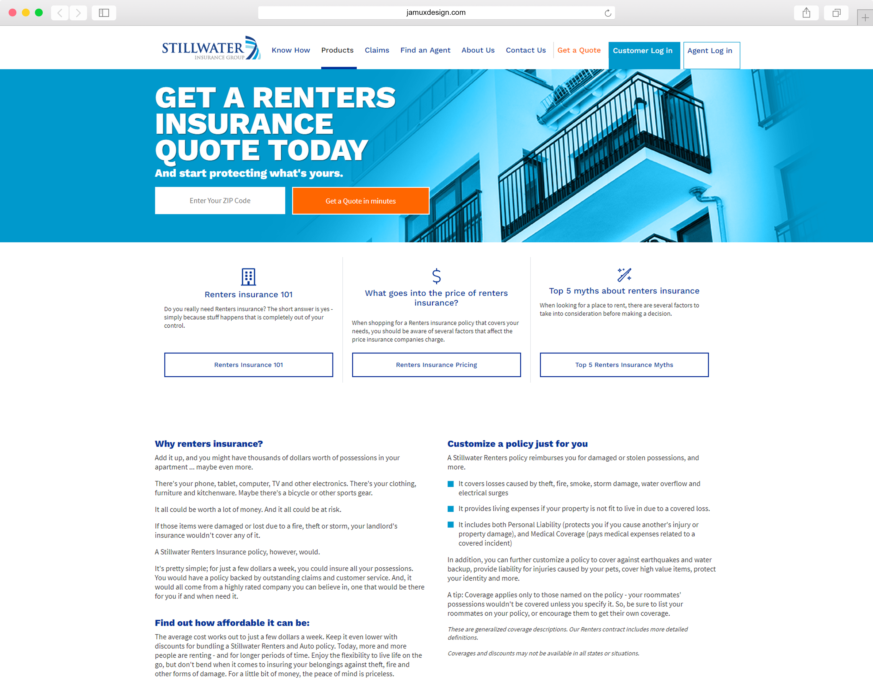
Once we have provided a compelling message to direct consumers to further investigate Stillwater as a potential insurer, we needed to strike the right balance between regulatory considerations, business rules, technology and an engaging design – all with the goal of a user being able to complete a quote and bind a policy in 5 minutes or less. A key feature within the marketing domain was to have the opportunity to initiate a quote at every touch point. View the Home and Auto Quote Case Studies for more details.


3. What am I purchasing and how much will it cost?
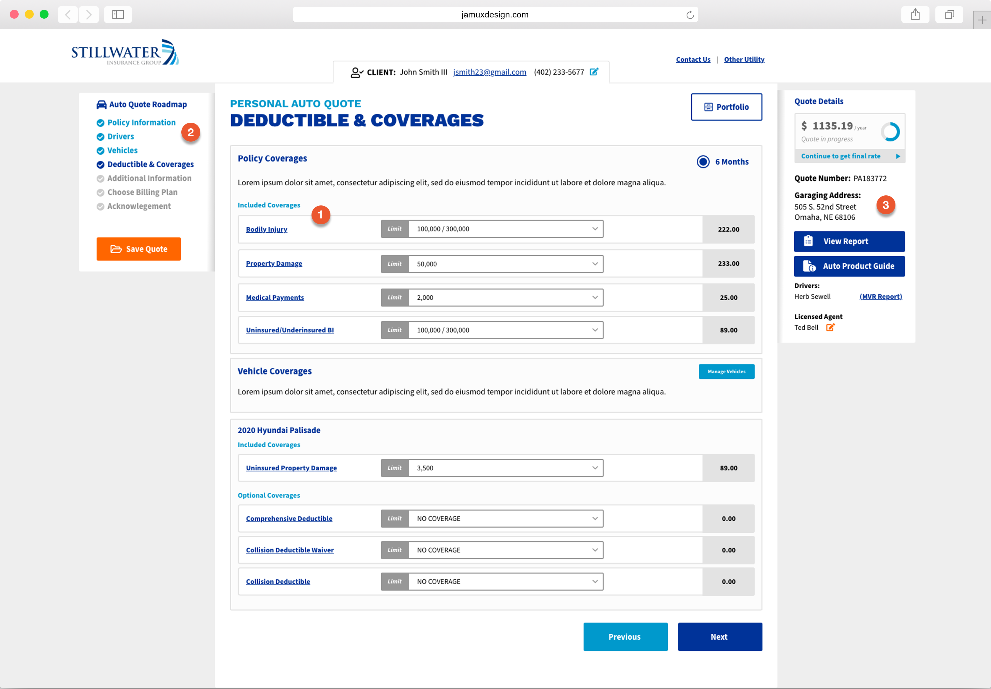
Allowing the consumer to see exactly what they’re getting, how much it costs and where they are on the quote was a guiding principle during the design and requirements phase. Of course at all points on the quoting journey, the user can save their quote and return anytime. The UX challenge was to take complex business rules and regulatory restrictions and design them in such a way as to be understandable and not intimidating.
1
Included Coverages. Allow users to see how much they’re paying for existing coverage as well as the ability to modify coverage limits.
2
Provide a roadmap so the user can know exactly where they are on their quoting journey. They can easily go back to each completed section.
3
A dynamic quote details panel will provide confidence to the user how much their policy is likely to cost, location information and who their licensed agent is.
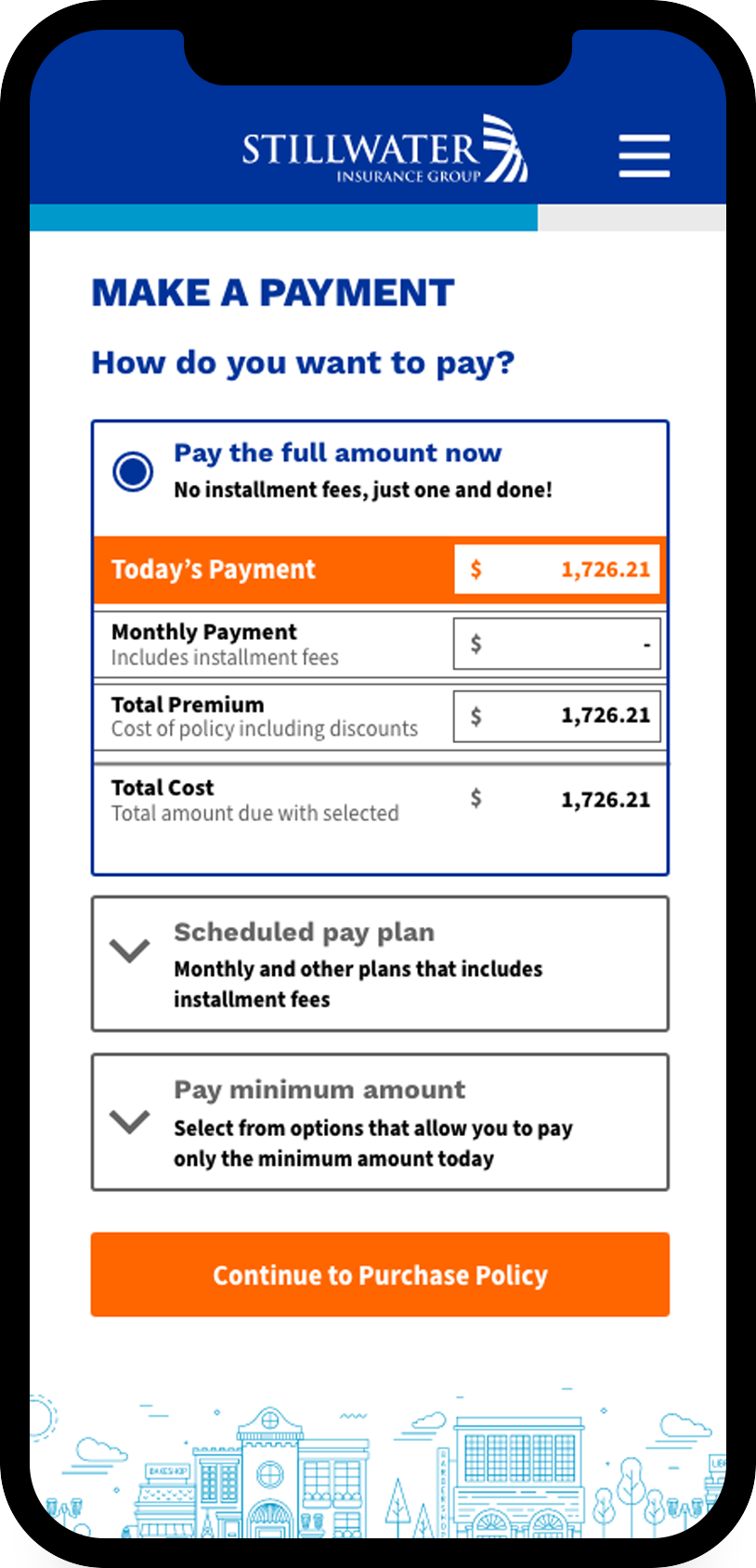
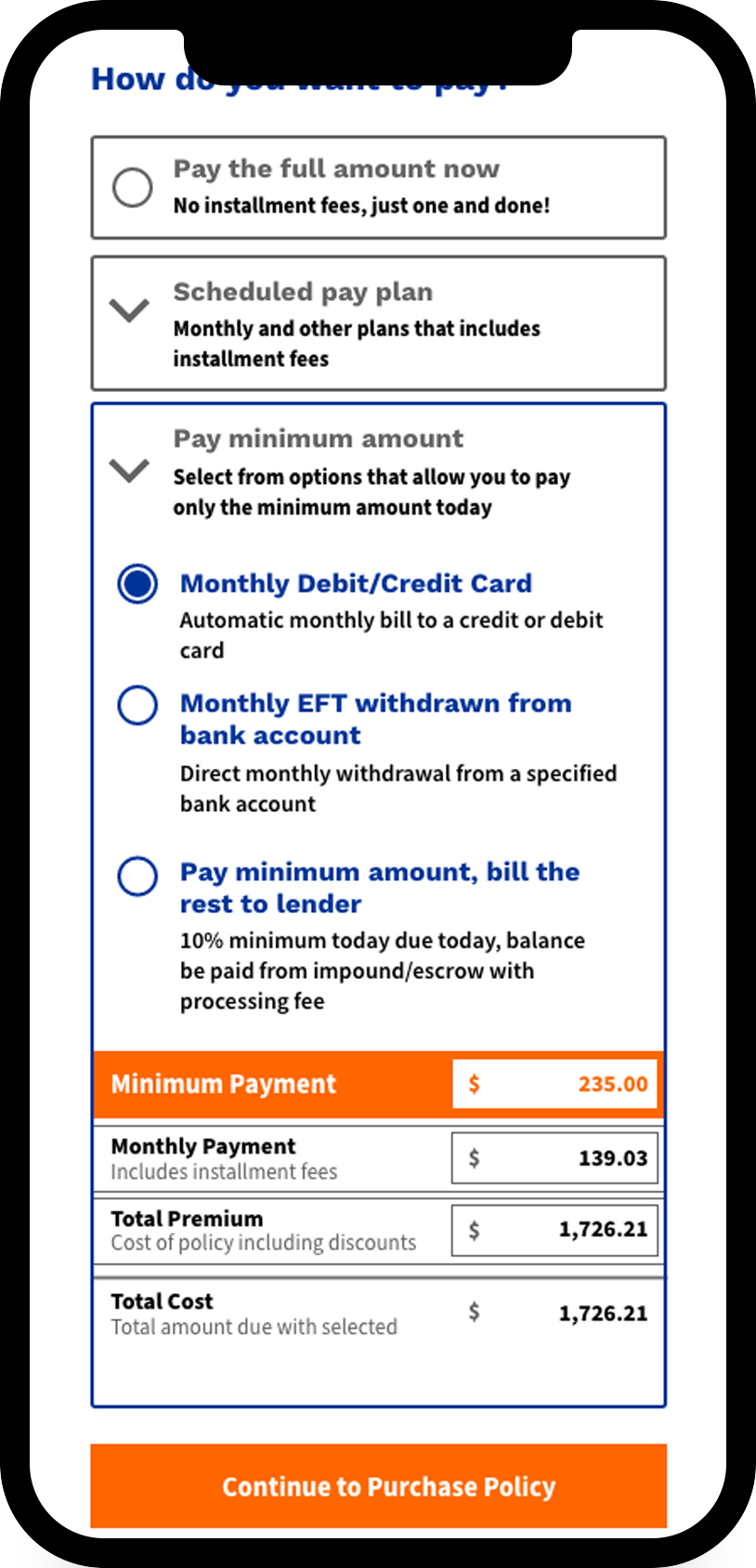
Making a payment is another example of this feature. Payment plans for Home Insurance are complicated and varied. The trick was to present all of the available payment plans while at the same time allow the user to see, clearly, what each payment plan entailed and allow them to, in essence, compare payment plans.
Providing a clear and understandable design pattern to afford both simple (renters) and complex (homeowner) payment plans to be consistent in purpose and design.
4. Manage your policy anywhere, anytime.
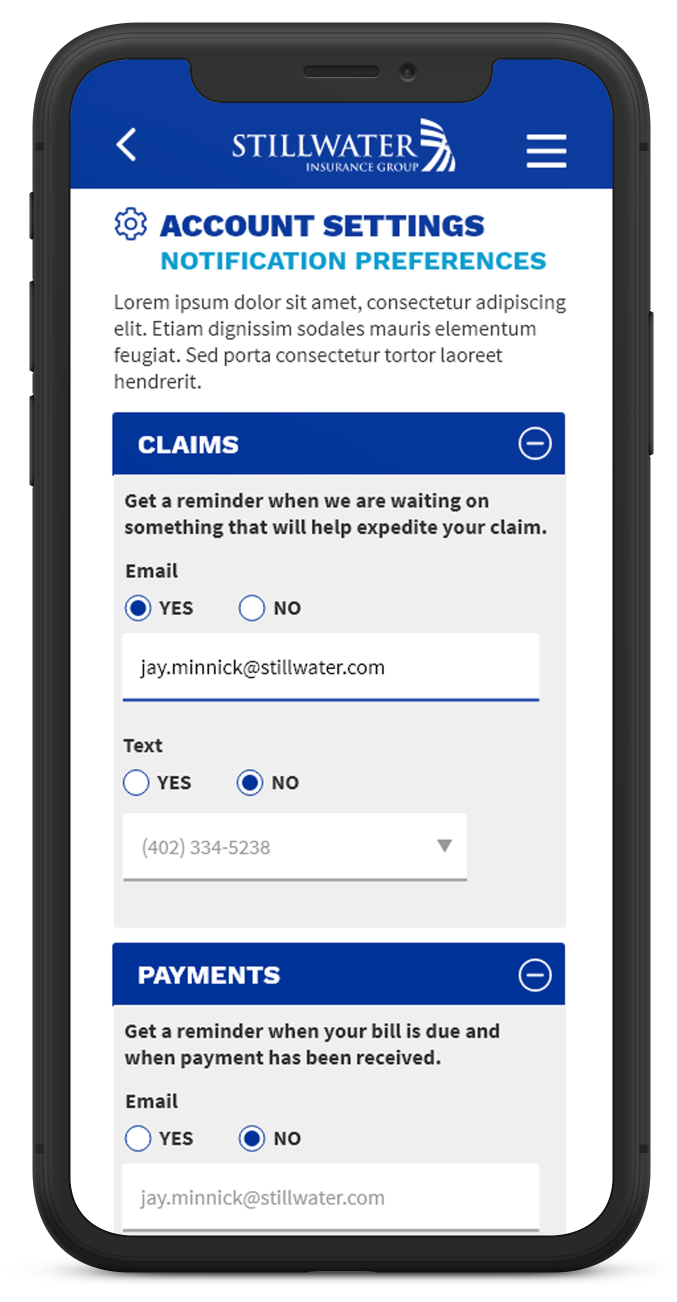
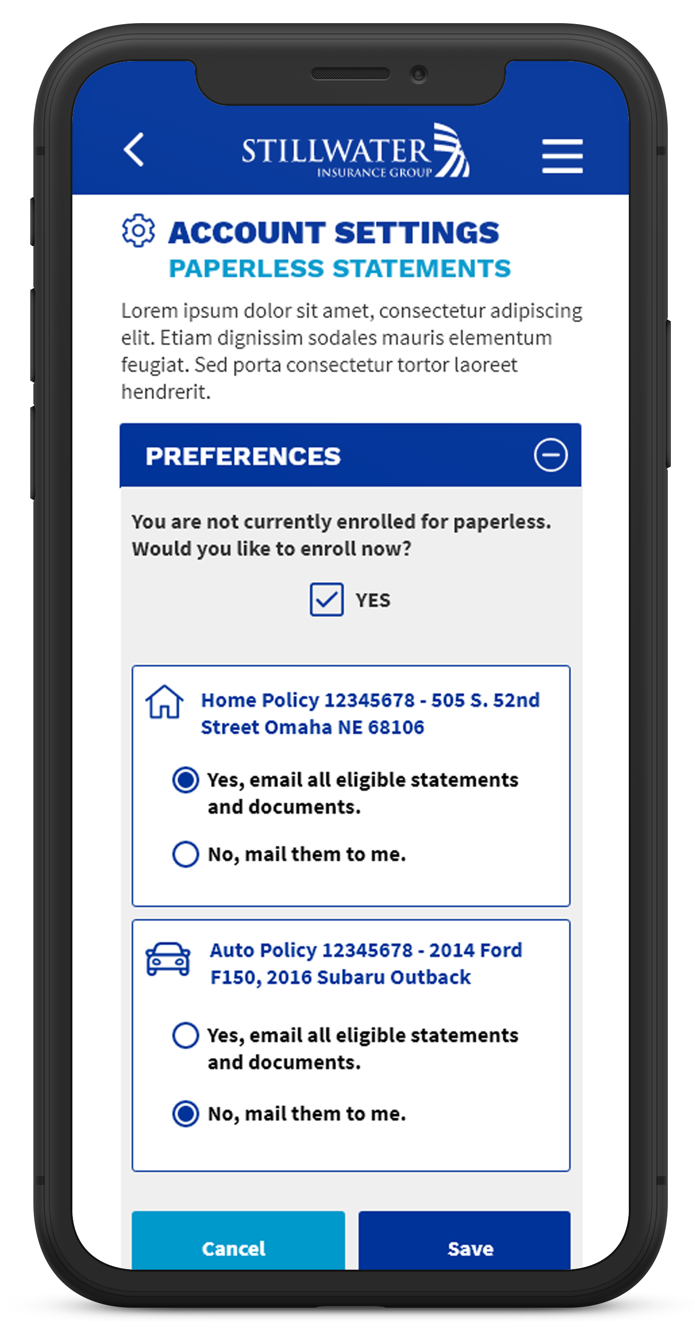
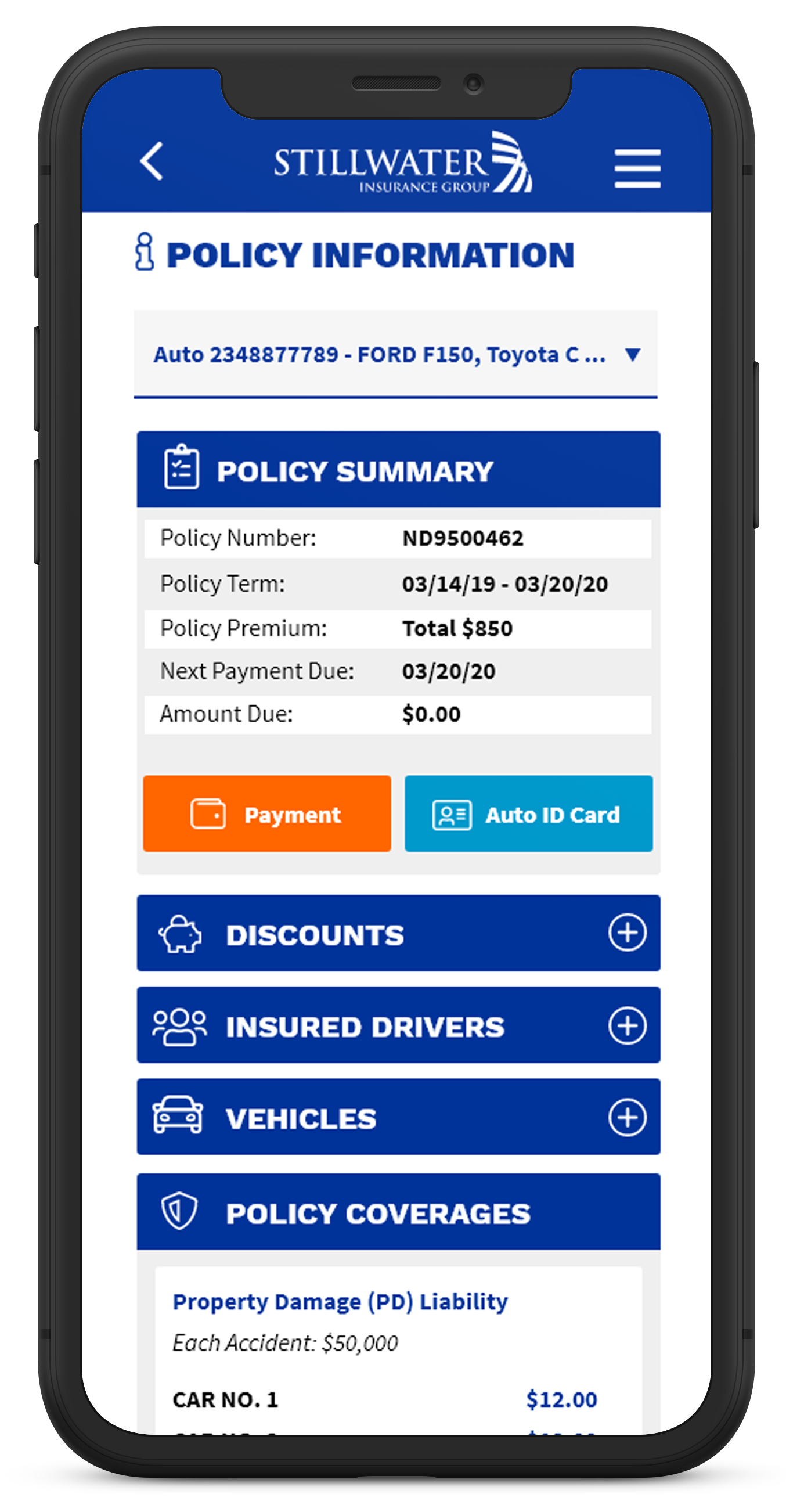
The power of policy management is now in the hands of the consumer. Update mailing address, download Auto ID card, change account preferences, and much more.
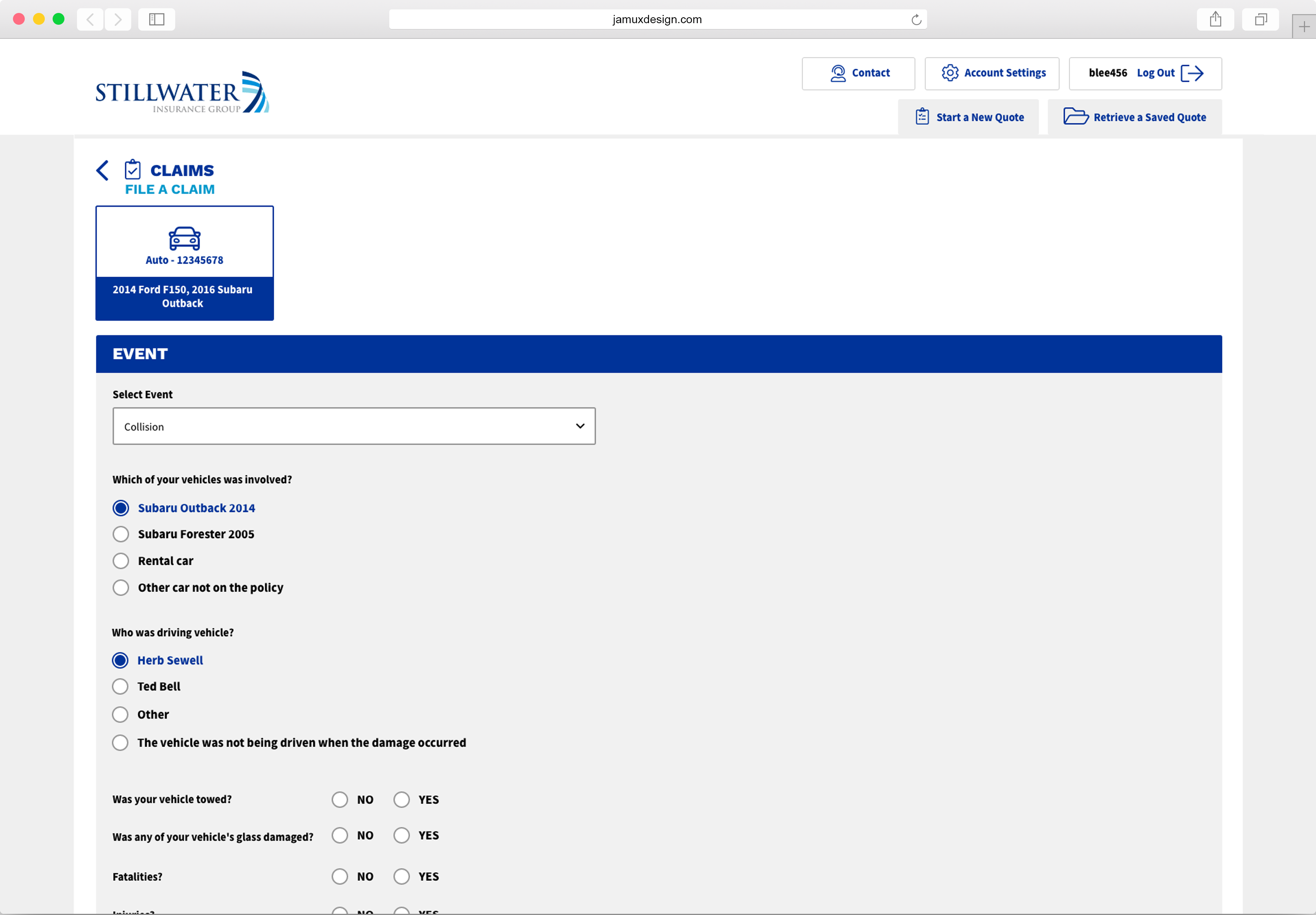
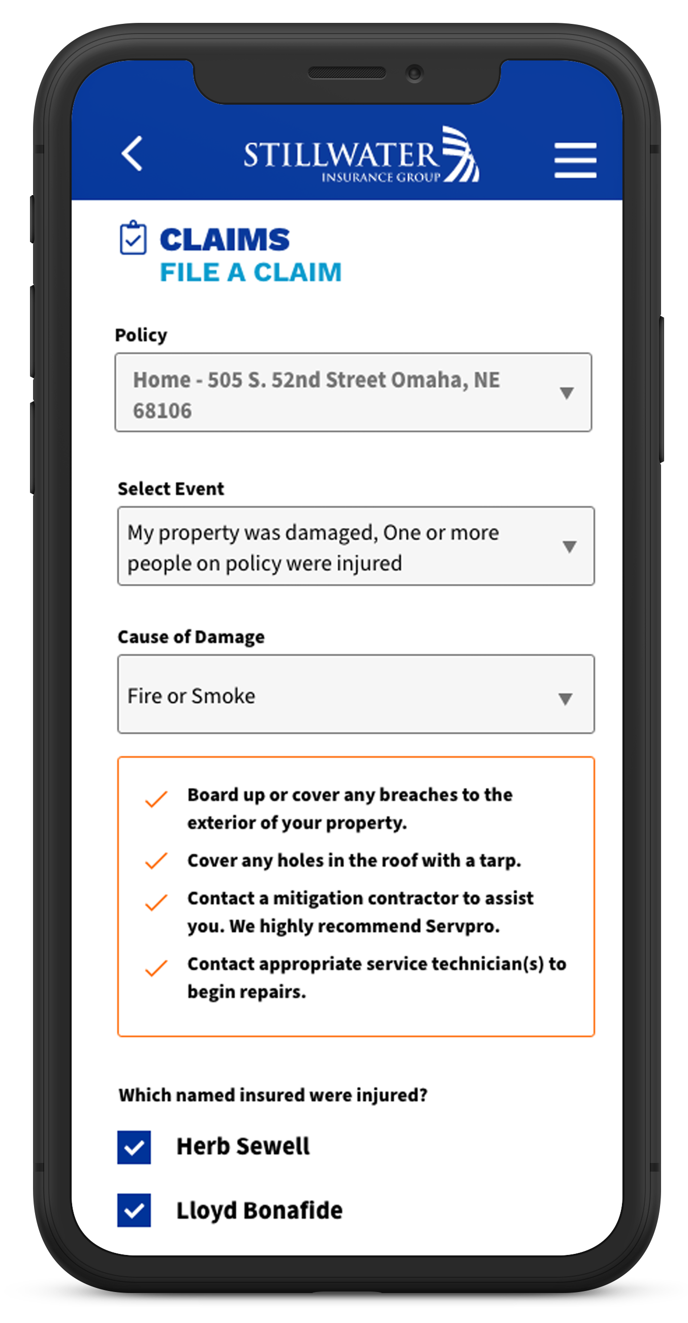
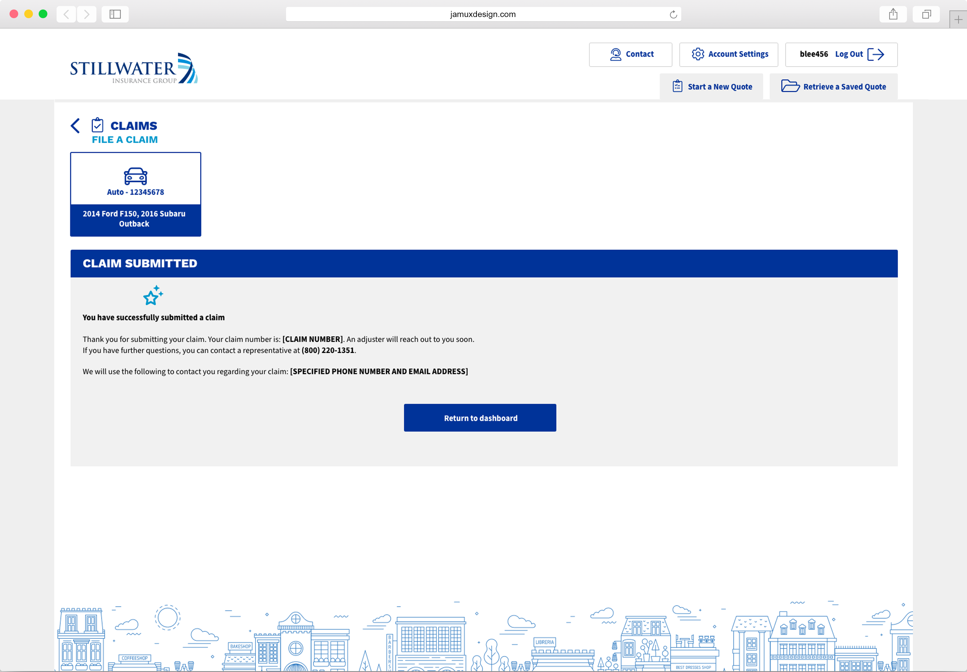
5. File a Claim
The essence of insurance is peace of mind. Things happen and having the ability to file a claim quickly and efficiently is a critical feature we needed to get right.
6. Auto ID & Roadside Assistance
Auto insurance cards and roadside assistance – essentials to a consumer facing insurance app.
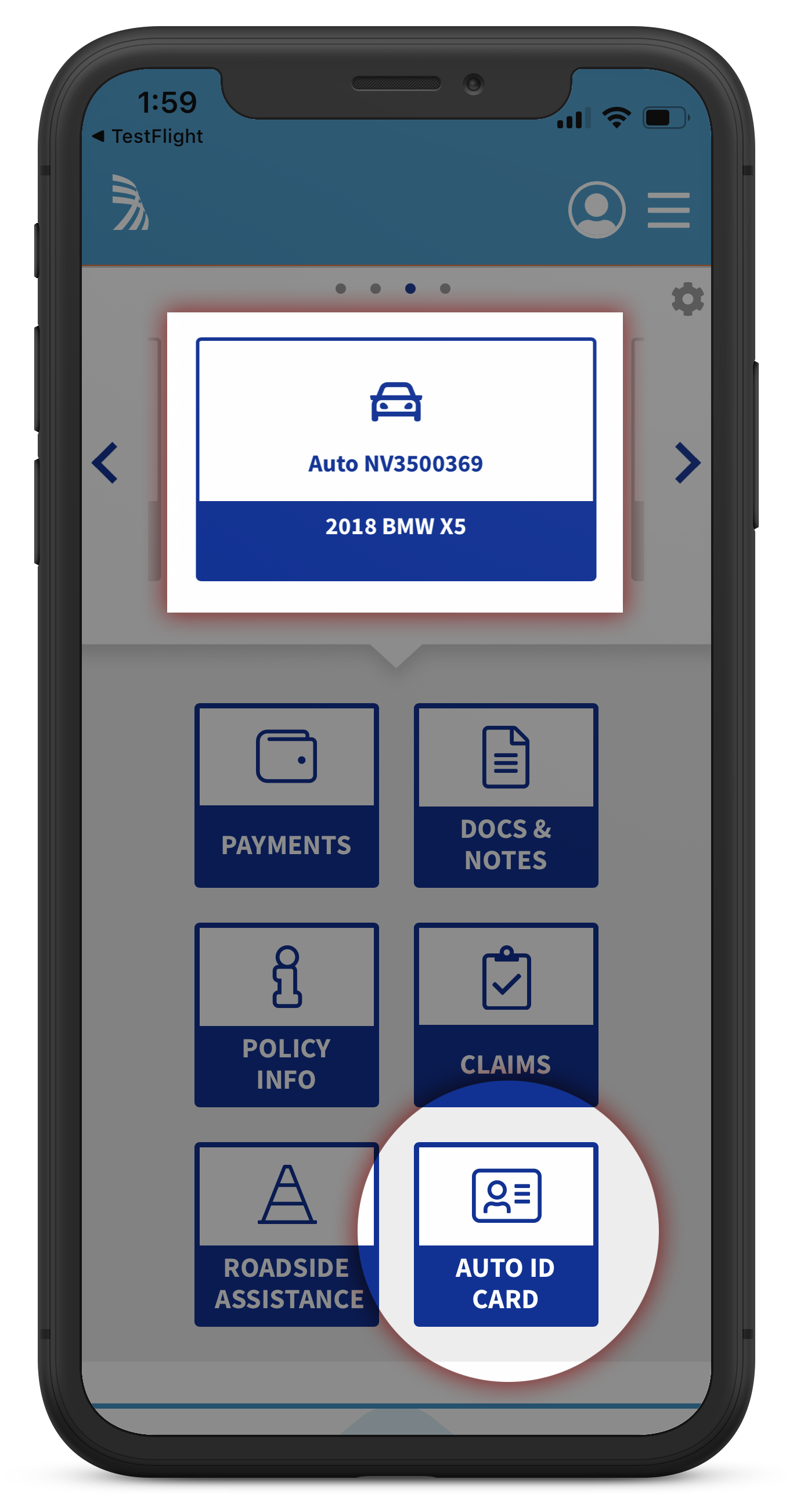
Accessing your insurance card is easy – even if you have multiple autos. Simply navigate through the policy selectors and click on the policy action button (auto id card).
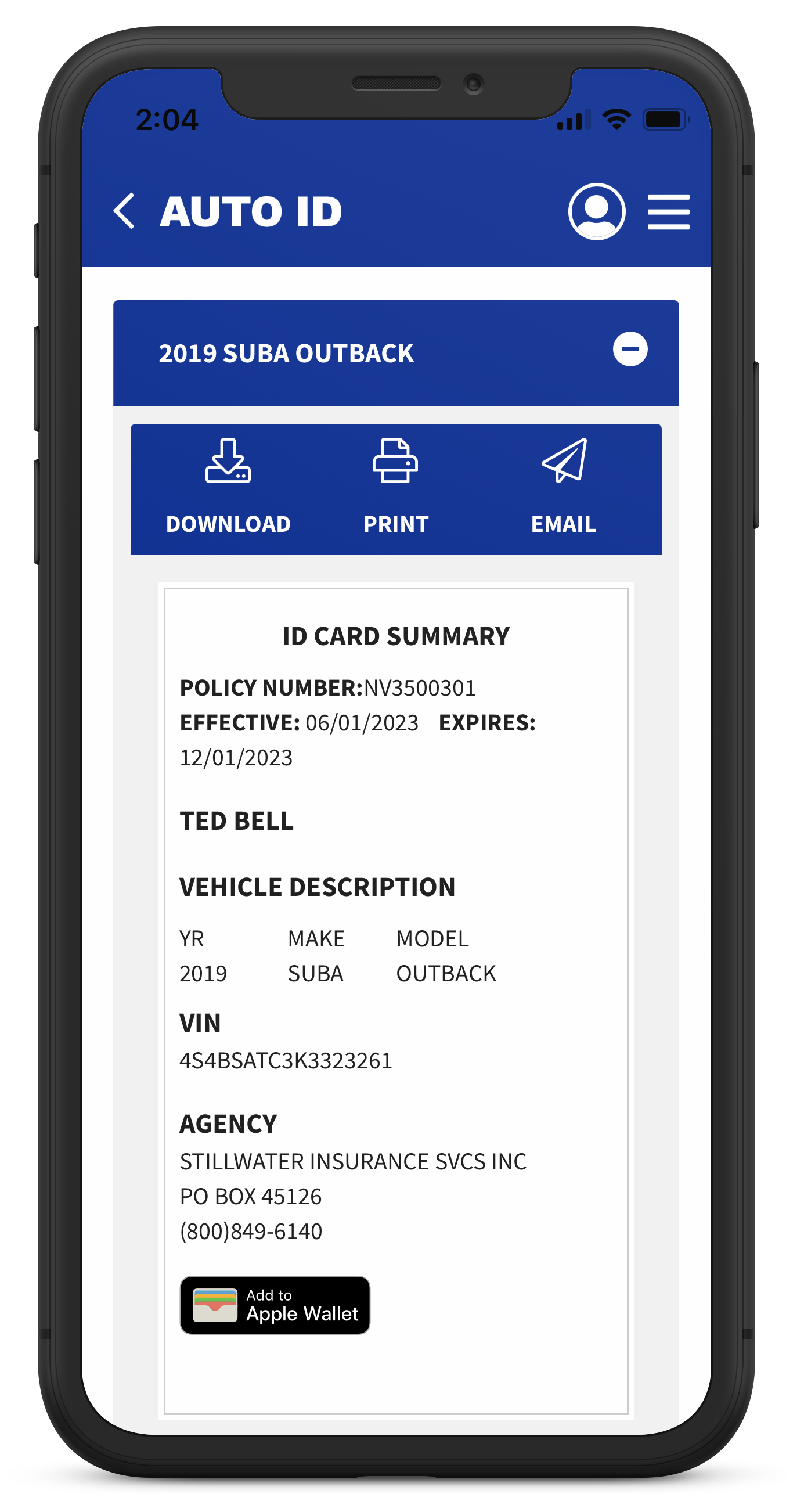
Your insurance card can be easily added to your Apple or Google Wallet as well as download, print a backup or email.
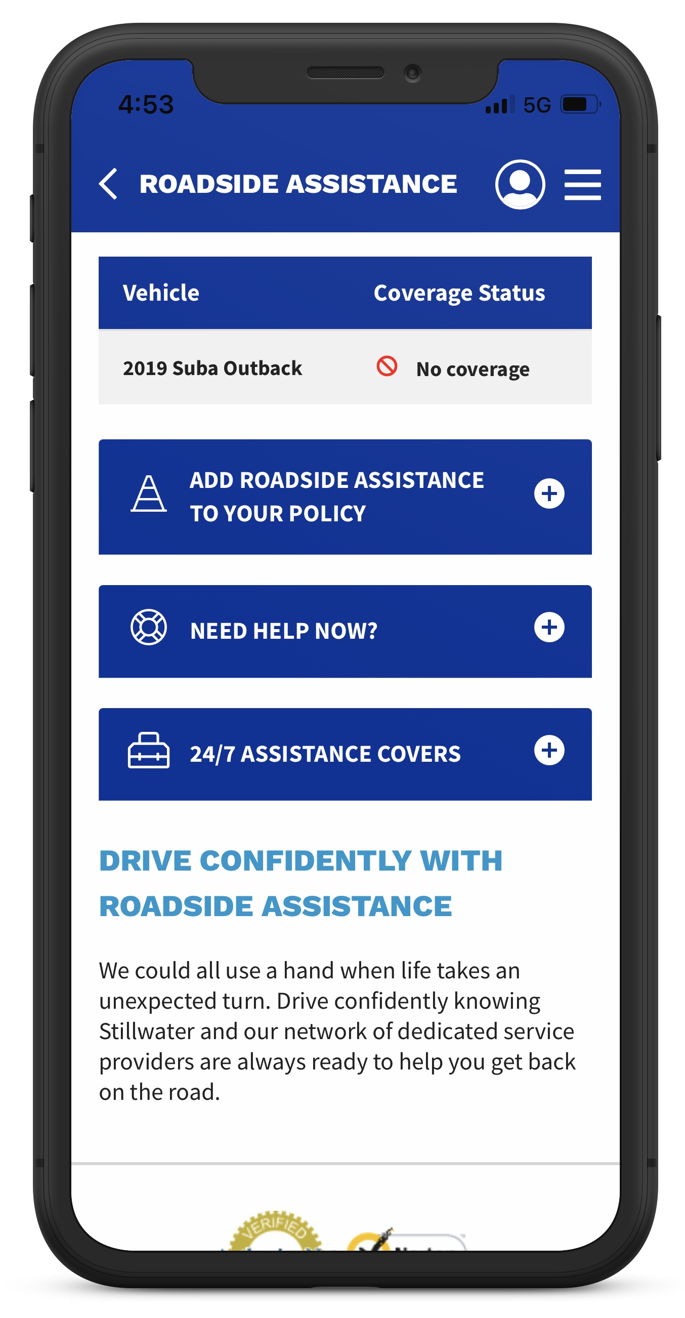
Policy holder can access roadside assistance in the same manner as auto insurance card. Don’t have roadside assistance with your auto policy? No problem, you can add it to your policy quickly and easily.
All wireframes & prototypes created with Figma

