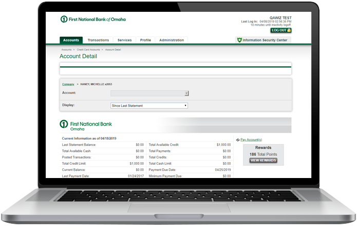
The Account Selector Case Study
A classic UI quandary: translating a complicated navigation structure into a flexible and desirable experience for the user. This case involves commercial credit card banking. Due to the data structure from the mainframe, the navigation of groups and accounts involve potentially 5+ levels of hierarchy.
The Challenge…
The navigation UI had to be multiple things at once – it had to accommodate a commercial entity that would be simple & intuitive from a navigational standpoint and yet be flexible enough to handle the most complex and intricate commercial credit card account navigation.
…The Solution
Working collaboratively with UI developer and product owner, we came up the the “Account Selector” – a means to navigate through a deep levels of credit card accounts – without resorting to a convoluted nested hierarchy design.


